Interior Design Masters
Around 18 months ago I made a bold decision; I agreed to go on a reality TV show, specifically a new interior design challenge show on BBC 2. It’s not something I ever thought I’d do and even now it seems a little unlike me to have done so.
But circumstantially it made sense; I had just left my job of over 10 years at Material Lab and was putting teaching very much on the back burner having grown tired of the direction it was going in. I had on-going writing jobs and a few projects on the go but I fancied a fresh challenge – to take myself out of my comfort zone and to test my design skills.
The show, titled Interior Design Masters, has just been released in the UK and will later be on Netflix, the magnitude of which I perhaps still haven’t quite got my head around yet. To write about it means giving away my progress within the competition, so spoiler alert…I went out in the first round. That’s something that I’m perfectly comfortable with, not least because not going any further meant that I got to focus my attention on my favourite and most important interior design project to date, Big Bit.
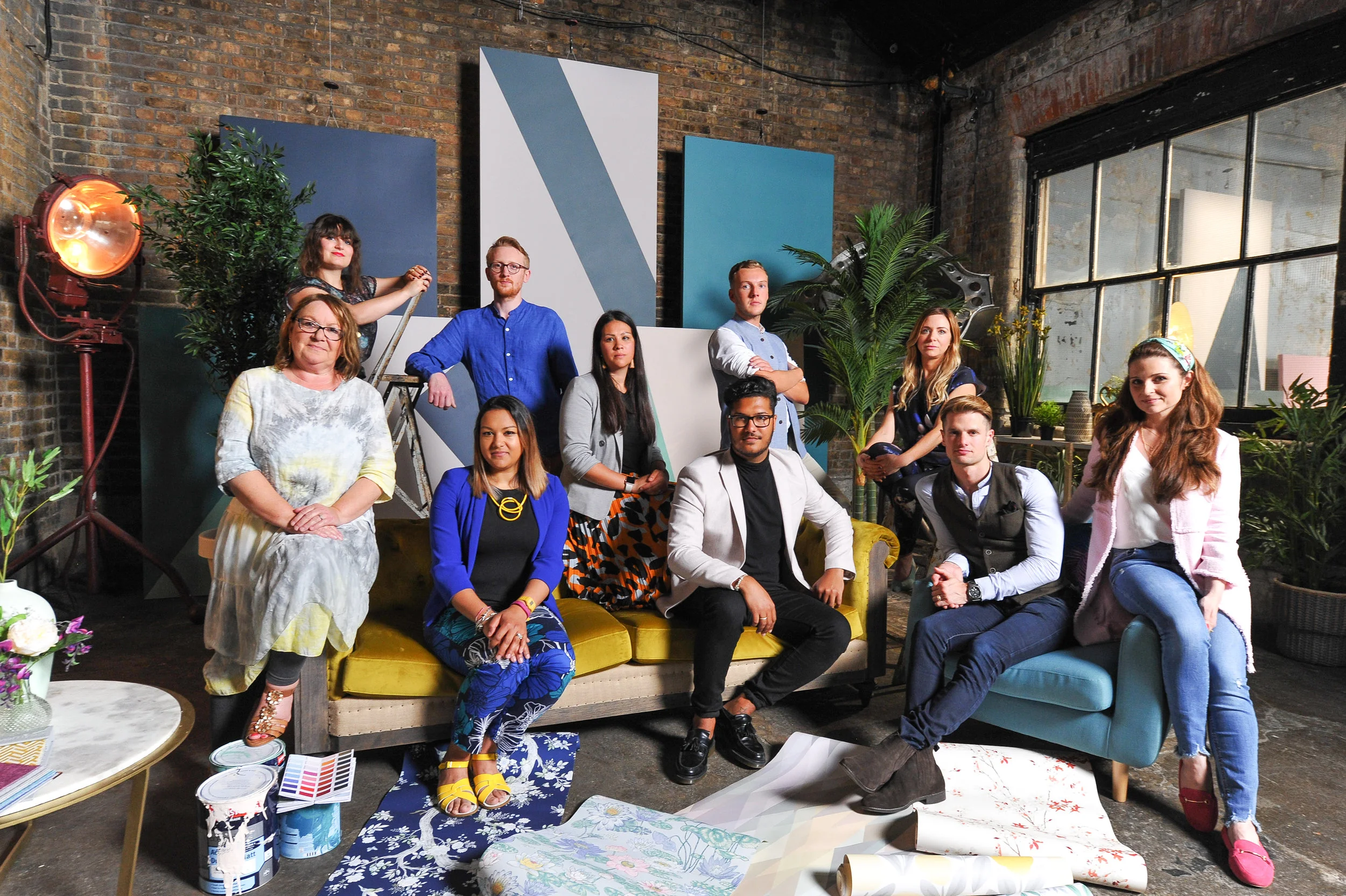
Interior Design Masters contestants
Focusing on the Show Home, the brief for first challenge suggested that the space should emulate a lifestyle that prospective buyers would covet, specifying that, amongst other things, the client would expect a contemporary, sophisticated and exclusive feel and look to the spaces within. Having been set the briefs to work on independently, myself and the other 9 contestants were put into 2 teams; live ‘on air’ as it were, with the view that we would then create a cohesive set of rooms within an actual show home.
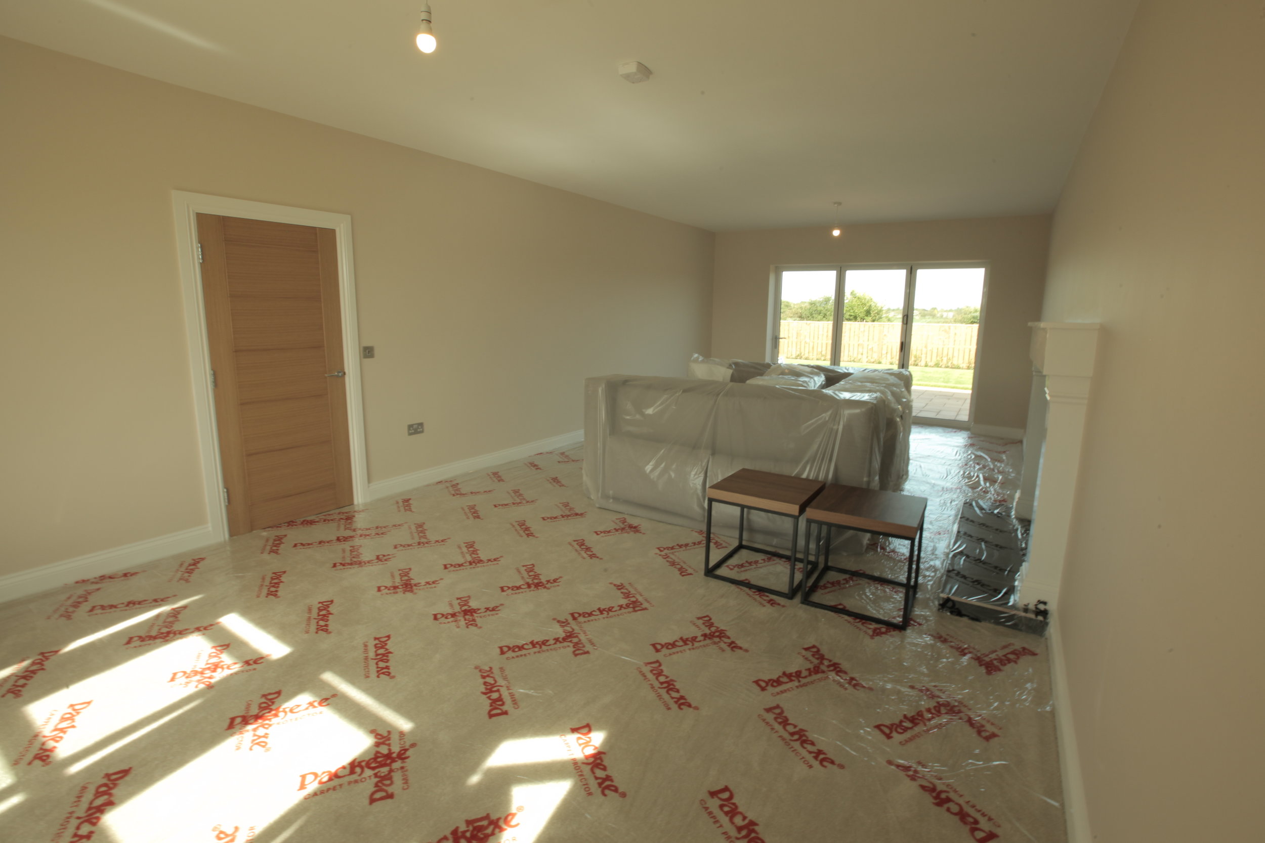
The existing space
The existing spaces were painted with every discount DIY stores favourite colour; Magnolia and the floors were covered with a beige deep pile carpet with extra wax and wain thrown in. Furniture with the distinct appearance of an identi-kit show home was optionally provided. A budget of £1,500 was also given to all participants, irrelevant of room size, as well as the additional proviso that original artwork, in keeping with your design, be present within the space.
Having been asked endless questions about how I work, what my influences are, whether I feel I have a distinct style and what I offer clients that might be unique in the preliminary rounds, as well as the pre-show filming at my home, it seemed clear to me that I should be showcasing my knowledge and experience of contemporary design. It also struck me that I should be laying a marker in the first round; this was a show about aspirational and inspiring interior design after all. I know from my experiences of designing trade show exhibitions that you need to be bold and make intelligent design decisions that help to capture the attention and the imagination of the prospective viewer in a busy environment. I was also aware that even with the most advanced cameras available, colour could still suffer from the age-old issue of weak translation on screen.
As such my design decisions followed a fairly straightforward path; the blank and inherently bland space should be imbued with elegant but striking features that break it from the mould of a your run-of-the-mill show home, with a contemporary and balanced colour palette and sophisticated designer objects throughout. My objective was to inject some show in a show home space. All of this on a super tight budget and just over 2 days to do so…whilst being filmed.
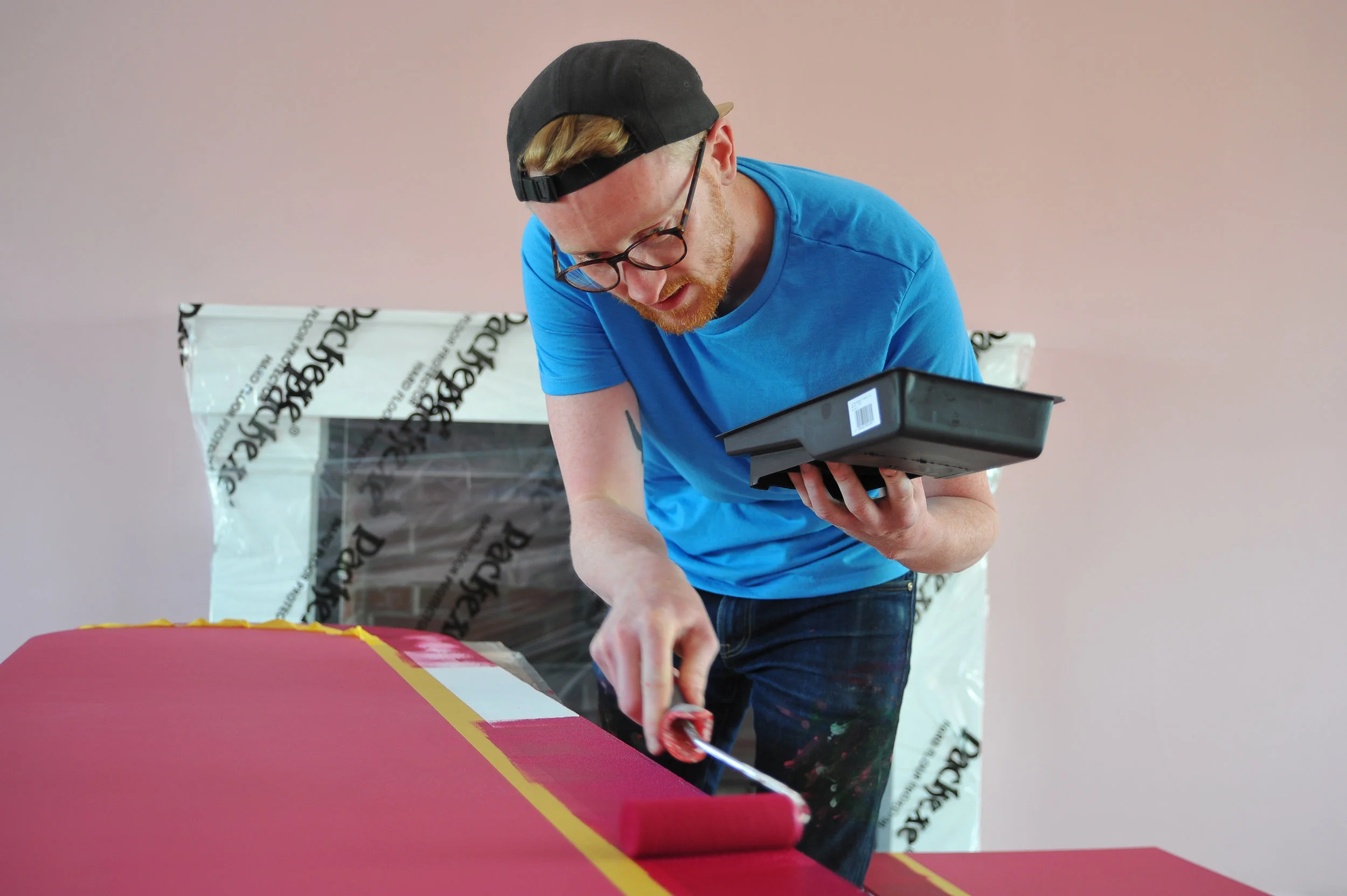
The arches developed from a couple of angles; I had noticed and reported upon a subtle trend for using tall arches with soft curves at Milan Furniture Fair the month before. A bit of research into the area (we were told we’d be filming in Newcastle) revealed that the city and surrounding area housed repeated arches in abundance, not least Pilgram’s Gate, Central Station and the Holy Jesus Hospital. With my decision to follow the mantra of “go big or go home” I decided upon a wall of arches that would embody the spirit and feel of a Venetian piazza, rather than a blank box. On top of this, the arches also served the purpose of filling the wall with the original ‘artwork’ required by the brief.
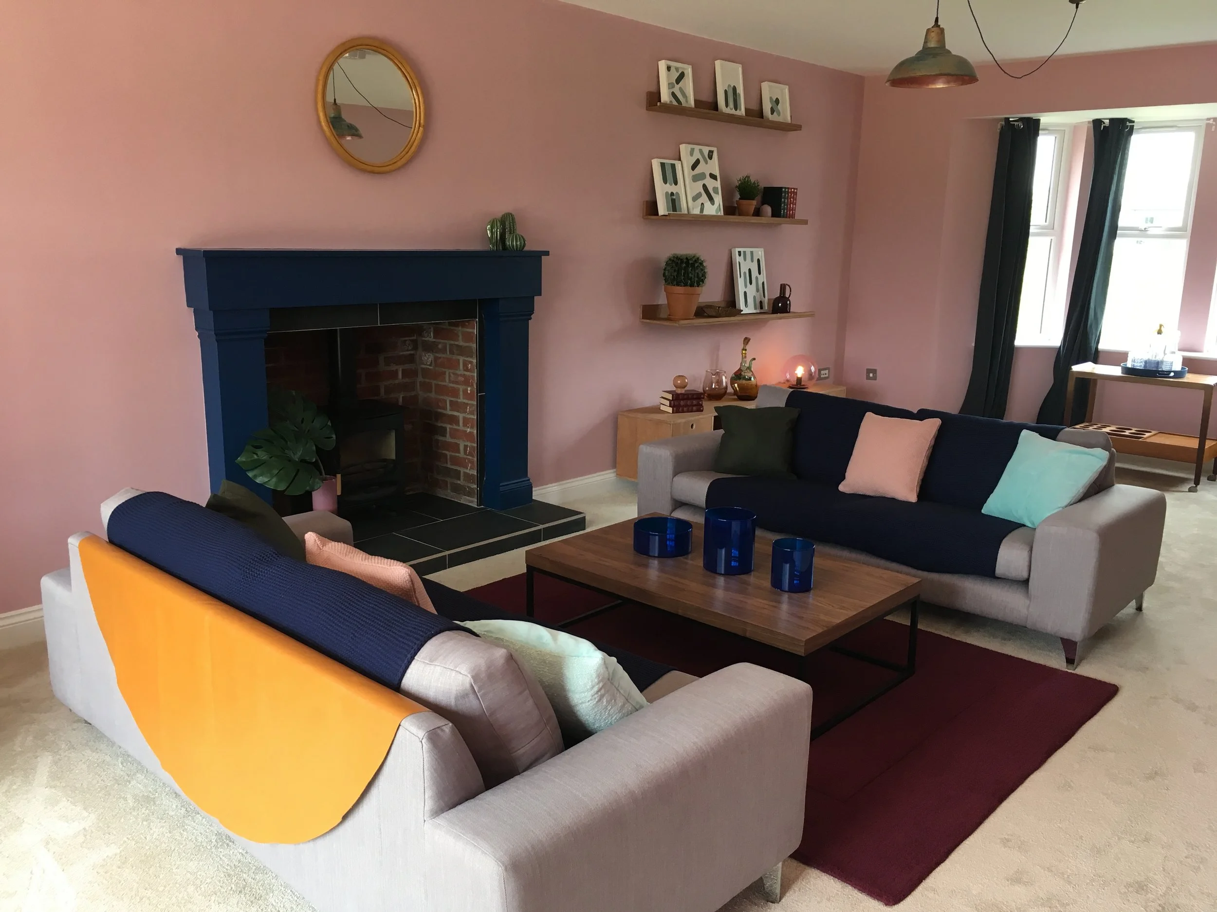
The arches also allowed for some tone on tone moments within the space, meaning a larger colour pallete, without going overboard. It’s always tricky deciding upon a main colour within a space, particularly when there is no client to discuss the options with. I knew I wanted to make the space feel comfortable, so a colour with a bit of warmth seemed essential, but given that the living room can be used throughout the day, it made sense for it to feel energising too. A nice mix of post-work retreat and place to entertain (and impress friends) made sense to me. A shade of colour that I had spotted popping up in design publications and at trade shows around the globe, soft pink blush, felt like it fitted the bill. This allowed for richer shades of luxurious raspberry and ruby to create the 3-D effect of the arches. To counter balance this, as well as extending the subtle influences of nature, I opted for small doses of colours normally associated with a more ‘heritage’ space; rich forest green and navy. This also allowed me to accentuate the only existing features in the room; the grand fireplace and the patio door reveal.
Having been supplied with off the shelf and exceptionally ordinary furniture I decided that something contemporary and bespoke would be more fitting for a luxury home on a design challenge show. I wanted to allow space for personal artefacts, as well as more of the original artwork required of the brief. The budget was tight so I had to use basic plywood (not MDF) but used my experience as a maker to create sharp and a minimal low unit with hairpin legs and shelving that reduced in depth as it ascended the wall. Time didn’t allow me to get the finish up to any sort of standard I’d normally work to, but perhaps I should have factored that in to the time allowance. The budget would never have stretched to any sort of sofa so I kept the two provided but adorned them with a semi circle of caramel coloured leather across the back and a chunky knit raspberry throw to add further depth of colour, materiality and texture. Given the size of the room I also felt that there could be more than one seating area, creating a more cosy ‘reading’ area toward the patio door, with screens, both old and new (made by me) available to close off the doors.
It’s not my place to judge any of the rooms created during this first challenge; there were two TV judges, plus an unknown representative from the housing development company to do so. But given the time restraints, tight budgets and new experience of being micced up and continually filmed, I feel myself and the other contestants did well to follow through on our plans and to transform our respective spaces.
Overall, it seems odd to me to think that there is a generic sales-based style that can be universally applied to a home, particularly one that is on a television show with aspirations of showcasing contemporary, cutting edge design. To prescribe ones style is one thing, and not necessarily the correct way of working when you are doing so with an actual client, but to prescribe a form of standard, even safe design style doesn’t really feel like designing at all. And even more importantly for me, when living in such times of uncertainty and instability we need colour, shape, texture and materiality to go above and beyond the norm and to offer distraction, and with it, some joy.
It’s now over to the other participants and it’s no spoiler to say that they were put under even greater pressure during future tasks and I commend them all for their efforts and wish them all the best of luck. As for me, I went big, I went home and I created Big Bit.


