Surface Design Show Awards 2021
Whilst design trade shows might still be largely on hold as a result of the pandemic, the construction industry as a whole has been encouraged to carry on business. Across the majority of towns and cities in the UK, the urban landscape will be showing signs of development and change, something that in itself may add an extra level of oddity when we’re finally able to venture further afield into places that we would have considered familiar pre-lockdown. But there’s one show that has continued the tradition of shining a spotlight upon new developments in the built environment, regardless of the ongoing restrictions. And whilst the show itself couldn't take place in a physical form, the Surface Design Show Awards has still managed to celebrate the best new design out there in the physical world. As ever, there are a plethora of amazing spaces, both inside and out, to enjoy.
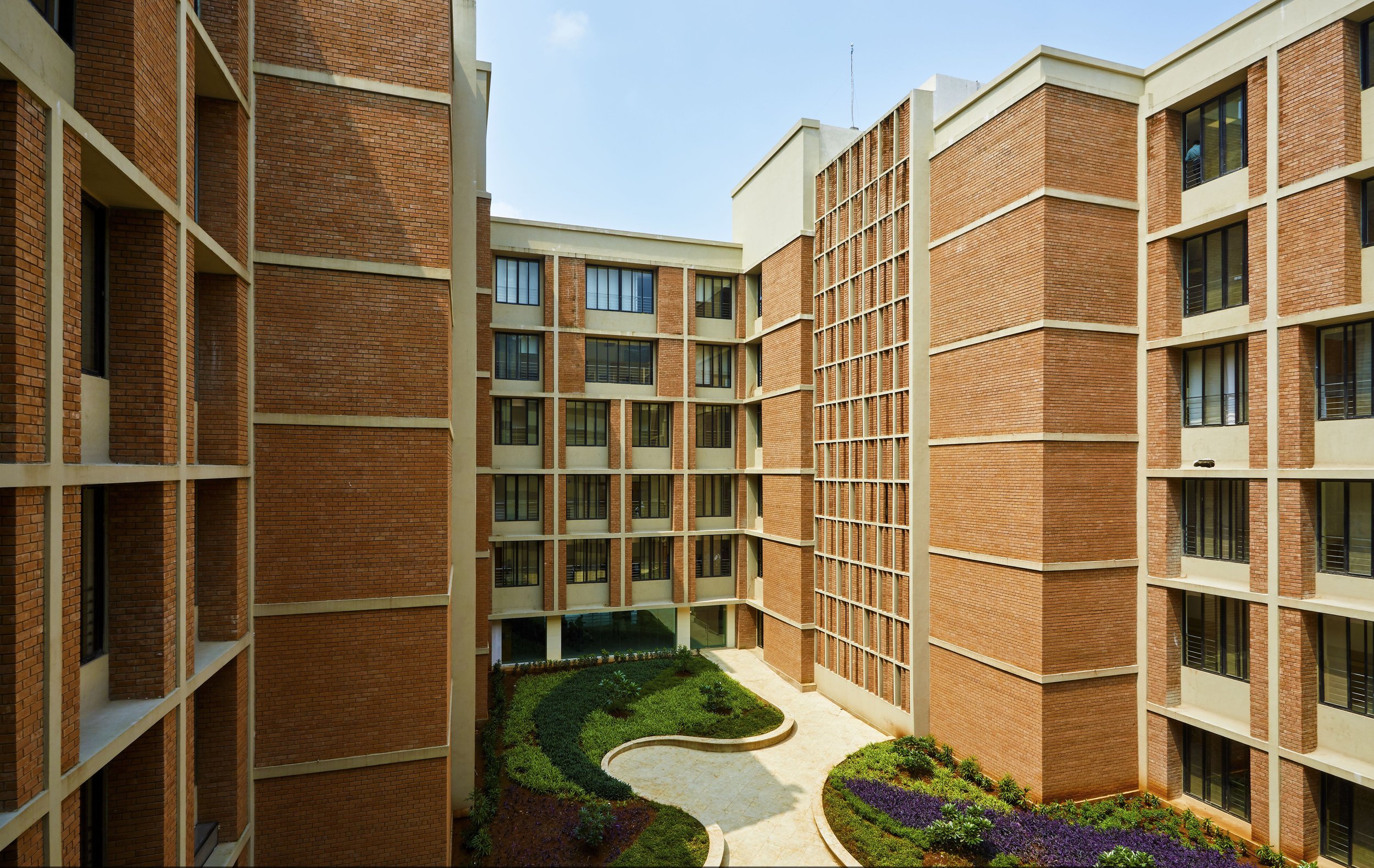
Perhaps the best place to start is the Supreme Award winner, which goes to IMK Architects for Symbiosis University Hospital. It’s the second year running that a project from India has taken the accolade, but its the ambition and scale of the building, considered use of sustainable materials and indeed its function as a multi-specialty healthcare facility, that won the hearts of the judges:
“This is a really beautiful solution using local materials and labour. The design of the façade is meaningful not just decorative, it shades the sun. The design of the façade is very much part of their sustainable strategy.”
On the surface, the building is a vast brick structure, so nothing new or particularly interesting there. But the story behind those bricks reveals a whole extra layer to the building because they were in fact manufactured on-site with a mix of naturally occurring local soils. The earth bricks were compressed with a block-making machine, which ensures no carbon emissions, and stabilized using only 5% cement. As opposed to conventional modern-day processes, which require kilns to dry the bricks, the earth bricks were sundried, making them a more environmentally friendly option. Not only that but the local approach to material selection also greatly reduced transportation requirements and overall wastage, as well as generating jobs for local masons. From a design perspective, the distinct aesthetic of the bricks, coupled with the flexibility they allow in terms of laying formats, has given the building a truly unique visual style.
Perhaps healthcare and wellbeing were naturally at the fore of the judge’s minds when making their selections this year, or maybe it’s a sector that has seen improved funding. Whatever the case, there were some notable winners from the sector beyond the Symbiosis University Hospital. Being asked to design a Maggie’s Cancer Care Centre has become a badge of honour for architects and designers since garden designer Maggie and her architecture critic husband Charles Jencks set up the initiative back in 1995.
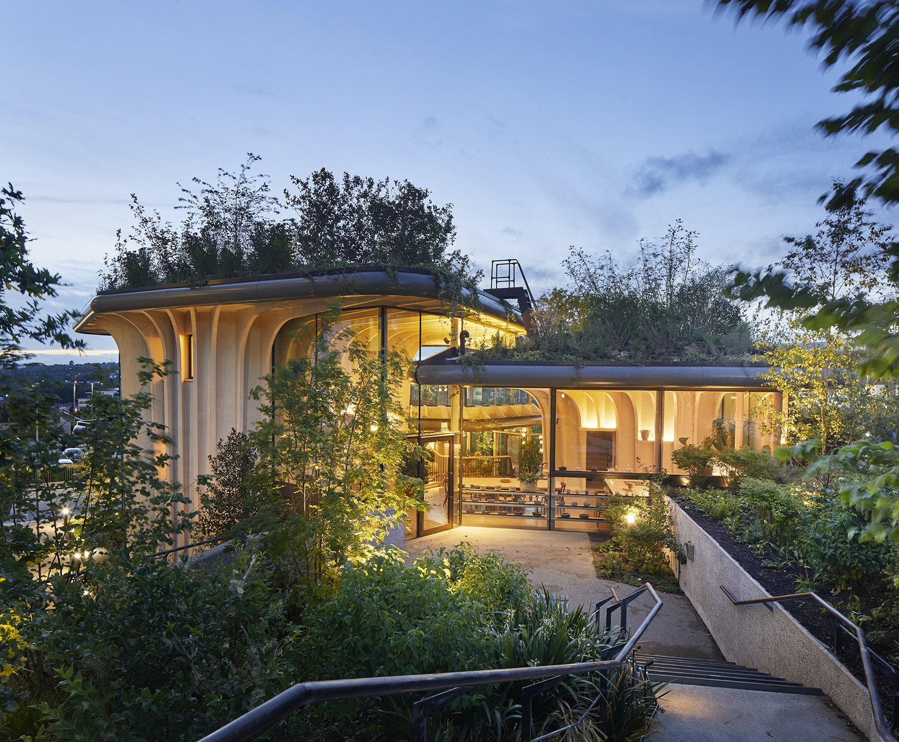
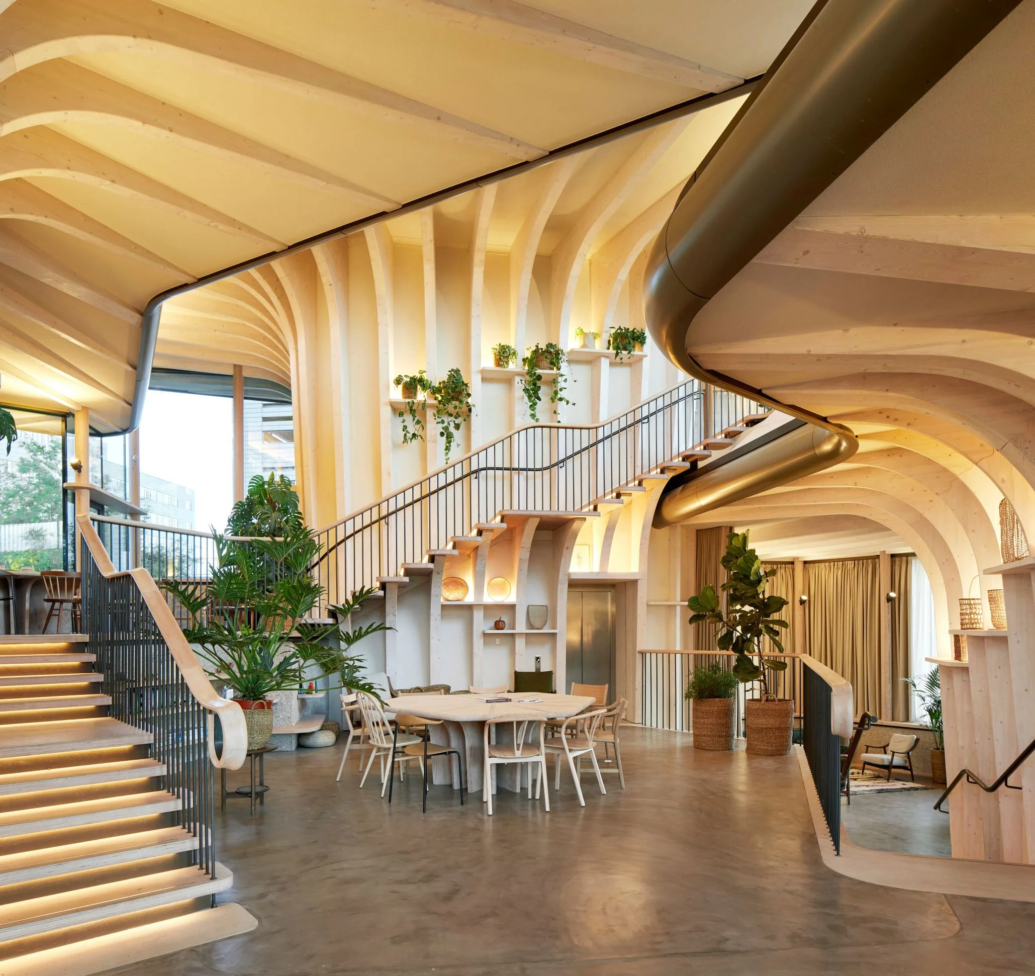
The latest centre, Maggie’s Leeds, was designed by Heatherwick Studio and took both the exterior and interior Light + Surface Award for the tiered design, which incorporates thousands of plants. The curved forms, shrouded in greenery, were in fact inspired by the memory of bathtubs used as planters in Thomas Heatherwick’s grandmother’s garden, although his structures are made from curved spruce timber. The space initiates the sense and creates a feeling of being embraced by nature, something that Heatherwick recognised as imperative in making “an extraordinary environment capable of inspiring visitors with hope and perseverance during their difficult health journey.”
Whilst a little more day-to-day in terms of a health care facility, Maida Smiles Dental Clinic is still very much a space with comfort and care at its core. Pedra Silva Architects were commissioned by Dr Pedro Guiterres to create a striking new aesthetic for his clinic in London’s Little Venice and receive the Public Building Interior Award for their creative endeavour. The practice feels open and has a natural flow through the reception area, which draws visitors (and even the more terrified patients) into the space. Once inside visitors are met with a clean and bright interior, which beautifully contrasts the Victorian and Edwardian surroundings outside. The most striking and memorable element of the space is undoubtedly the feature wall that stretches out behind the reception desk. Taking direct inspiration from ceramic dental implants commonly used in restorative dentistry, it consists of 500 handmade white ceramic discs that hover off of the wall in a honeycomb style. Elsewhere, concrete has been used to create the reception desk and careful management of space has been utilised in creating an effective dental theatre in a relatively small footprint.
Aside from healthcare environments, there were awards given to spaces that further imbue a sustainable approach throughout, including Silo Restaurant designed by Nina+Co. The space was awarded the Commercial Building Interior for its zero-waste approach to materials; something that the designers followed the lead of the chefs on.
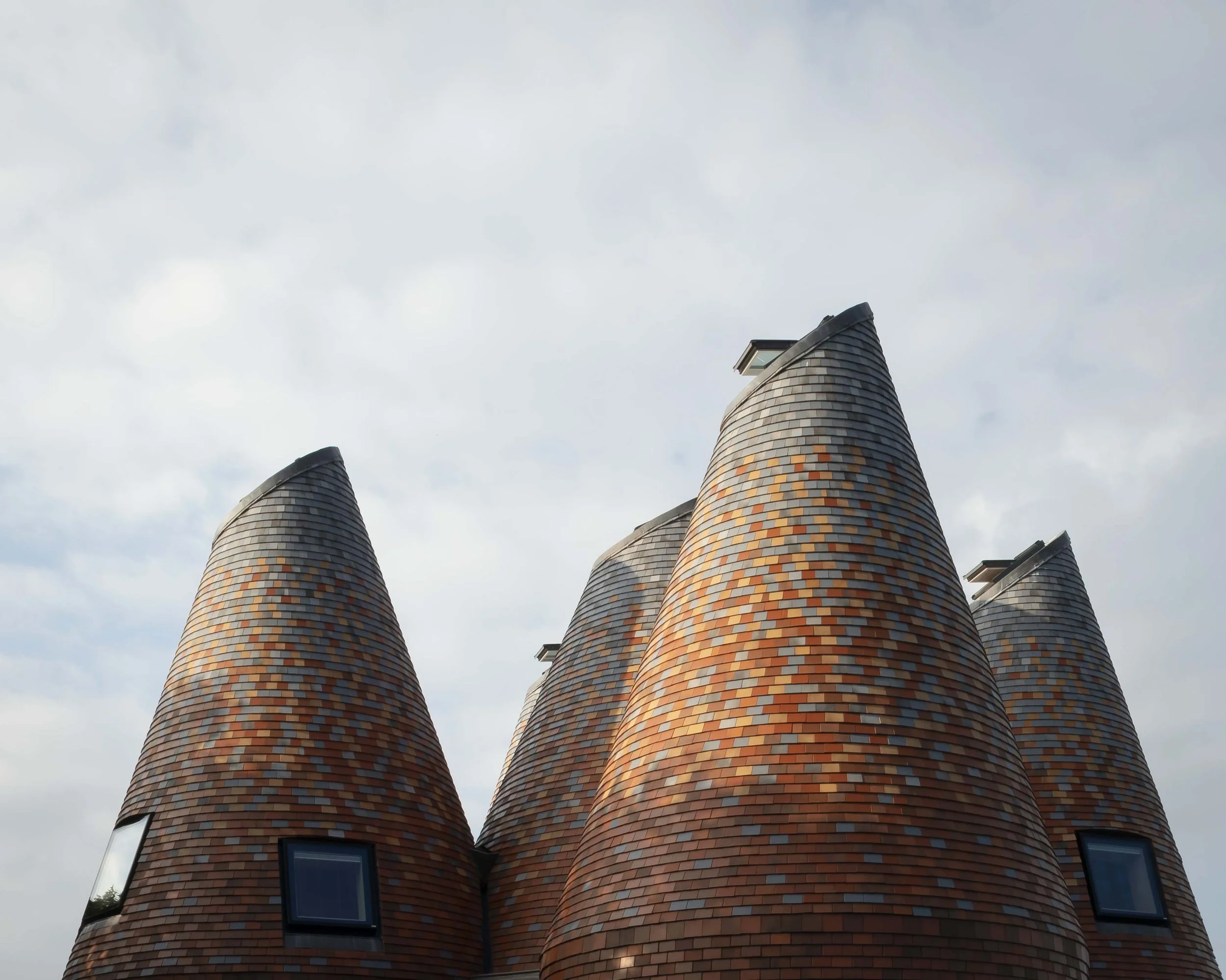
Food and drink were also the inspiration for the winner of the Housing Interior and Housing Exterior awards. Once used as hop-drying facilities, oast houses are an instantly recognizable feature of the countryside of Kent, but ACME’s modern interpretation of the pointed towers for Bumpers Oast adds a chromatic aspect to the customary form. The 5 conical structures are covered in Kentish-style tiles but 8 shades are used to create a sumptuous slow fade from dark red at the base through orange to blue at the peak.
Its some comfort to know that whilst we may not quite be able to see it all in person yet, there has still be some great and grand design happening outside of our own four walls.
For more information on all the winners and nominated projects visit the Surface Design Show site.
This article was first published by Design Insider Live.


